
GOD CAN
Project Date: 2023-2024 Duration: 3 months
Location: Remote Role: UX/UI & Brand Designer
God Can is a Christian streetwear line that utilizes clothing as a conduit to bring His word to life and offers comfort in tough times. This line aims to target the unconventional Christian looking for God outside the four walls of the church.

Project overview
Problem:
The e-commerce site featured an ineffective design, poor mobile usability and a lack of engaging visuals. As a result, the website was not generating the desired traffic and failed to resonate with the desired target audience.
Solution:
I aimed to create a more user-friendly experience by designing a responsive site that was easy to navigate. I also wanted to create trust and establish their brand with improved product photography.
Tools used:
Adobe Illustrator, Figma, Shopify
Question
How might we create a better shopping experience for customers visiting the website?
Competitive analysis
& market research
To ensure the success of the website redesign, a comprehensive competitive analysis was essential. I identified 5-10 direct and indirect competitors and meticulously analyzed their websites. This analysis focused on key aspects such as site layouts, the quality of images used, mobile responsiveness, and ease of navigation. Competitors generally featured high-quality product shots and simple, clean layouts. However, their weaknesses included a lack of clear call-to-action elements on the homepage and the inability to zoom in on items on product pages. By understanding these strengths and shortcomings, we gained valuable insights that informed our design decisions, ensuring the revamped website not only met but exceeded user expectations.
USER research & takeaways
Once the Competitive Analysis was completed, I went on to interviewing and getting direct feedback from potential customers viewing the website. For this info, it was easy to get participants as my client already was a part of an entrepreneur support group. To avoid influencing responses, I asked the group to give their initial thoughts on the website and what they feel should be improved. The following charts illustrate the results from the interview:
80%
Said imagery looked untrustworthy
90%
Said mobile site was not responsive
60%
Said site layout could be improved
Key Issues
-
The website's design was outdated and not user-friendly, particularly on mobile devices.
Navigation was cumbersome, leading to a frustrating user experience.
-
The site featured only generic mockups and model images taken with cellphones, which lacked professionalism and appeal. This also created a sense of distrust with potential buyers.
Branding and imagery did not attract the intended target audience of unconventional Christians seeking expressive streetwear.
-
The website struggled to engage users, resulting in low traffic and poor conversion rates.
There was no distinct visual identity, as the brand lacked a logo and cohesive branding elements.
DESIGN PROCESS
When doing a competitive analysis on other Christian Streetwear brands as well as looking over the previous site, I observed how other brands incorporated their collections onto one page. This made navigating the site easier for those who knew exactly what they were looking for. With this observation in mind, coupled with the valuable insights gathered during the user interviews, I began creating sketches, low-fidelity wireframes and a site map to solidify the layout.


Wireframes

SITE MAP
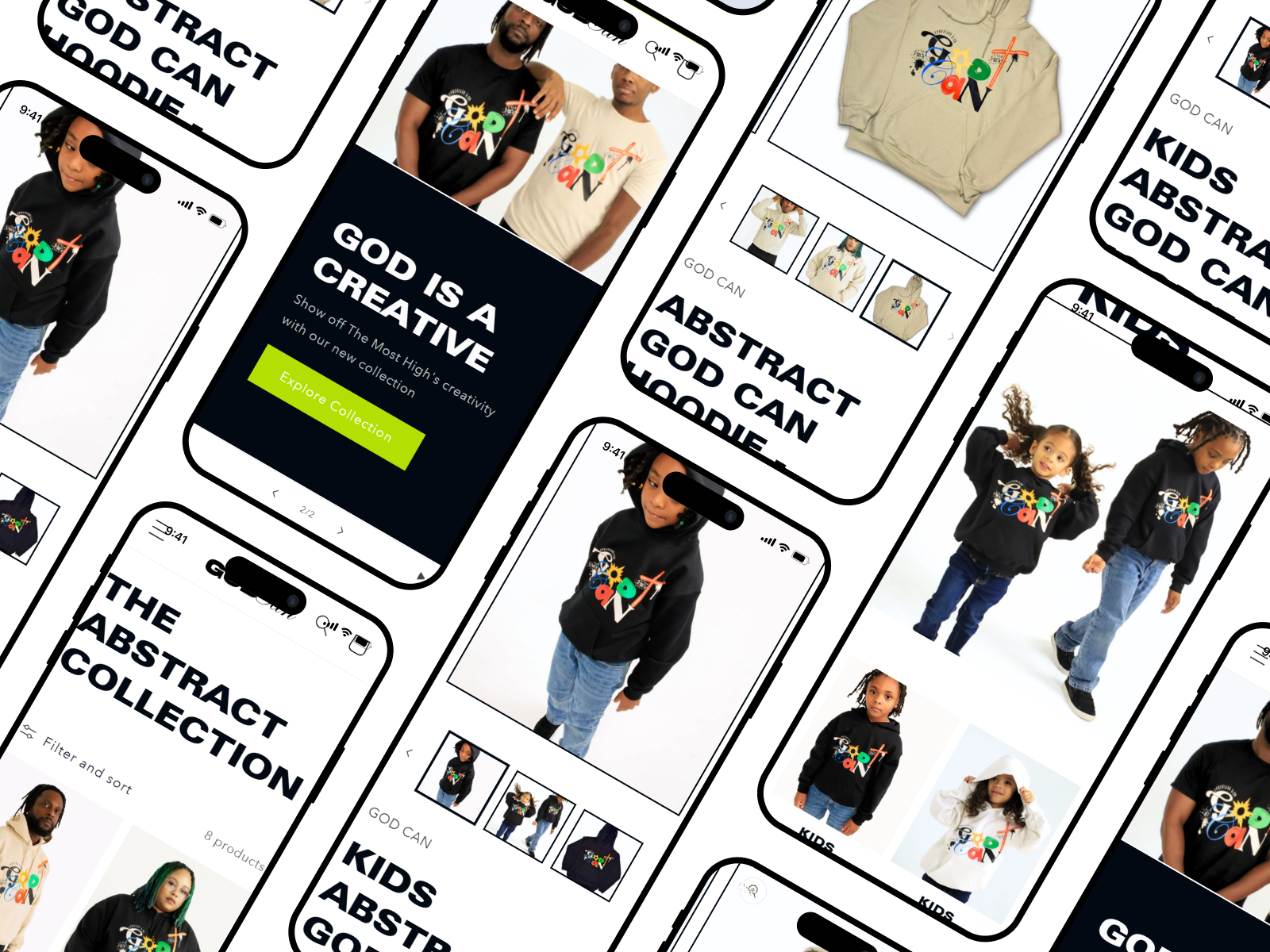
DESIGN SOLUTION
Clean, minimal & user-friendly design

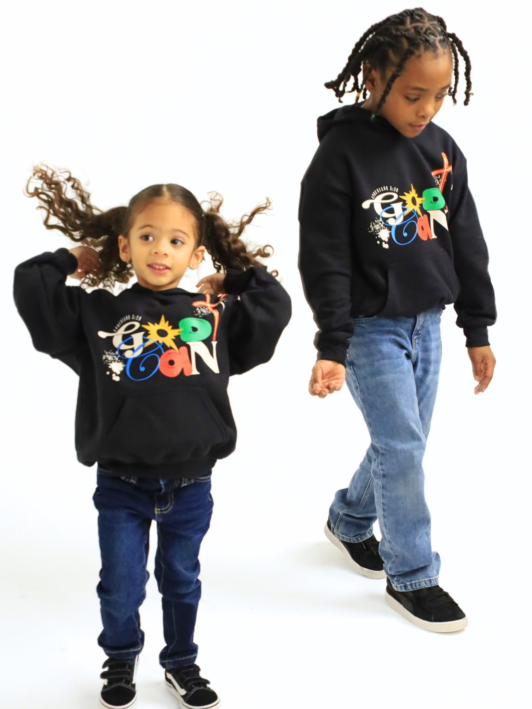
To revamp God Can's website, I focused on creating a simple, user-centric design that offered an intuitive and engaging experience, especially on mobile devices. I streamlined the shopping process by showcasing glimpses of each collection on the homepage with the option for quickly adding items to the cart, while also separating collections in the navigation for targeted shopping. In addition, I developed a strong visual identity, including creative directing a brand photoshoot, in order to feature high-quality product images on the site to build trust and credibility. The call-to-action buttons were specifically highlighted in green not only to stand out but to signify prosperity and abundance, aligning with the brand's values. These changes aimed to enhance user experience, increase traffic, and improve engagement with the target audience.
BRAND KIT
LOGO DESIGN
For the logo, I aimed to craft a straightforward yet meaningful design that represents the diverse aspects of God's nature. I selected a bold, heavy font for the word "God" to convey His immense power and authority. In contrast, I chose a more fluid, script font for the word "Can" to create a visual distinction and to highlight the message that with the Almighty, all things are possible.

Primary Logo

Secondary Logo

typography

color palette
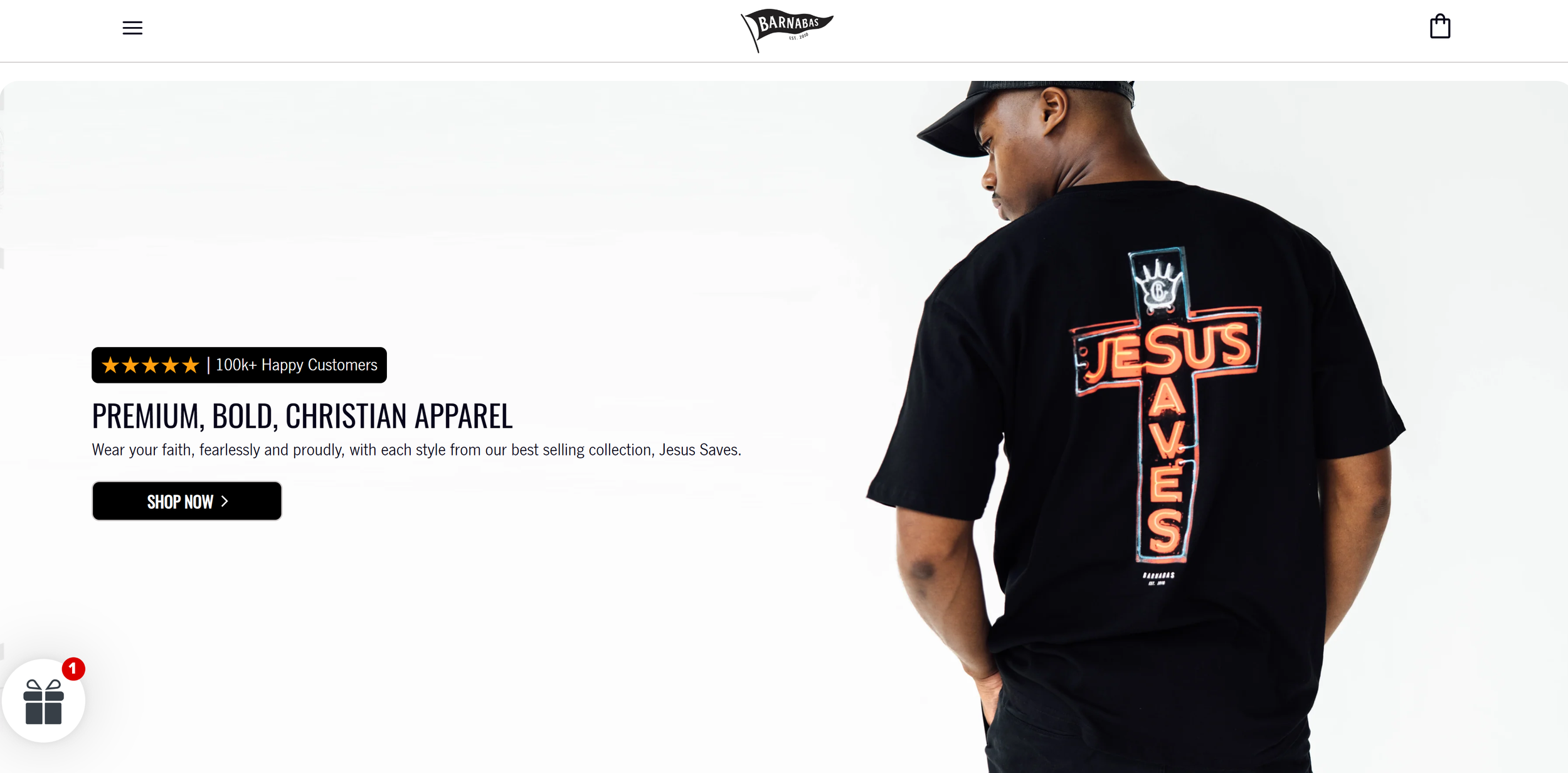
SEE THE SITE LIVE
RESULTS & IMPACT
Within the first 30 days after the website launch, the site experienced the following:
2%
conversion increase
5%
increase in sales
“The flow and look of the website is 100% better than before. Everything looks professional and trustworthy.”
original Brand images
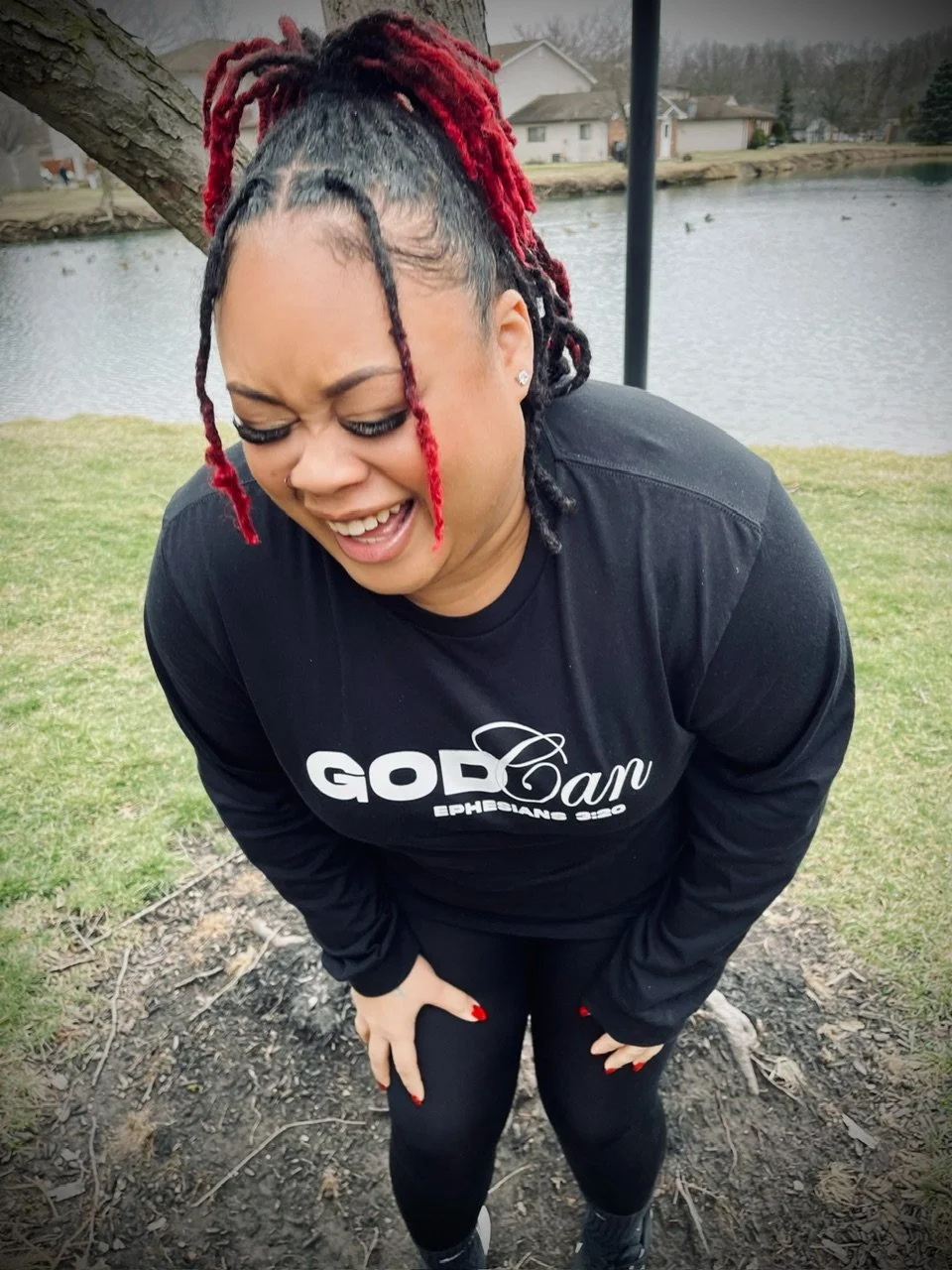

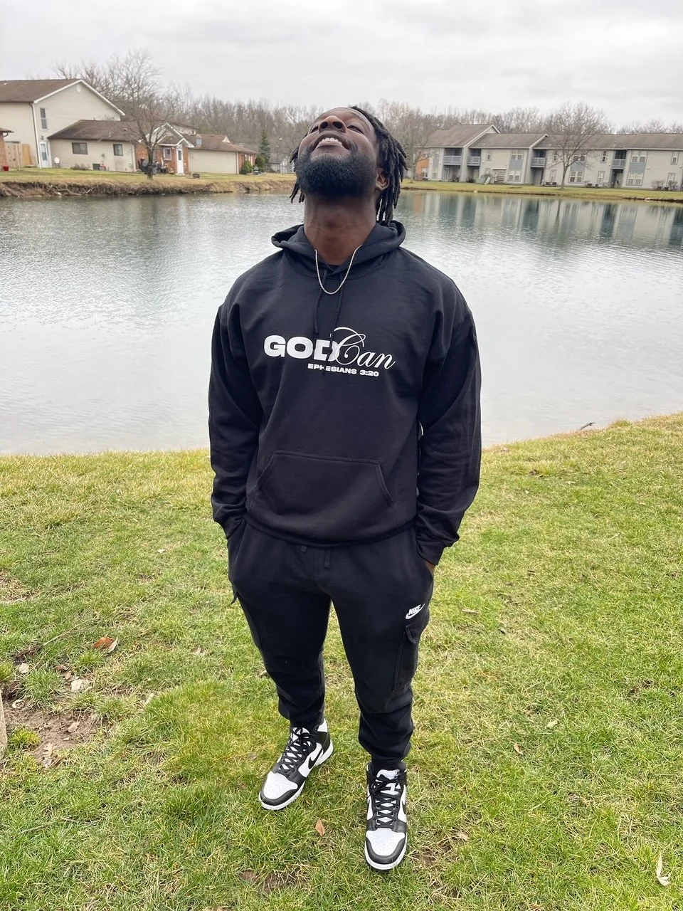
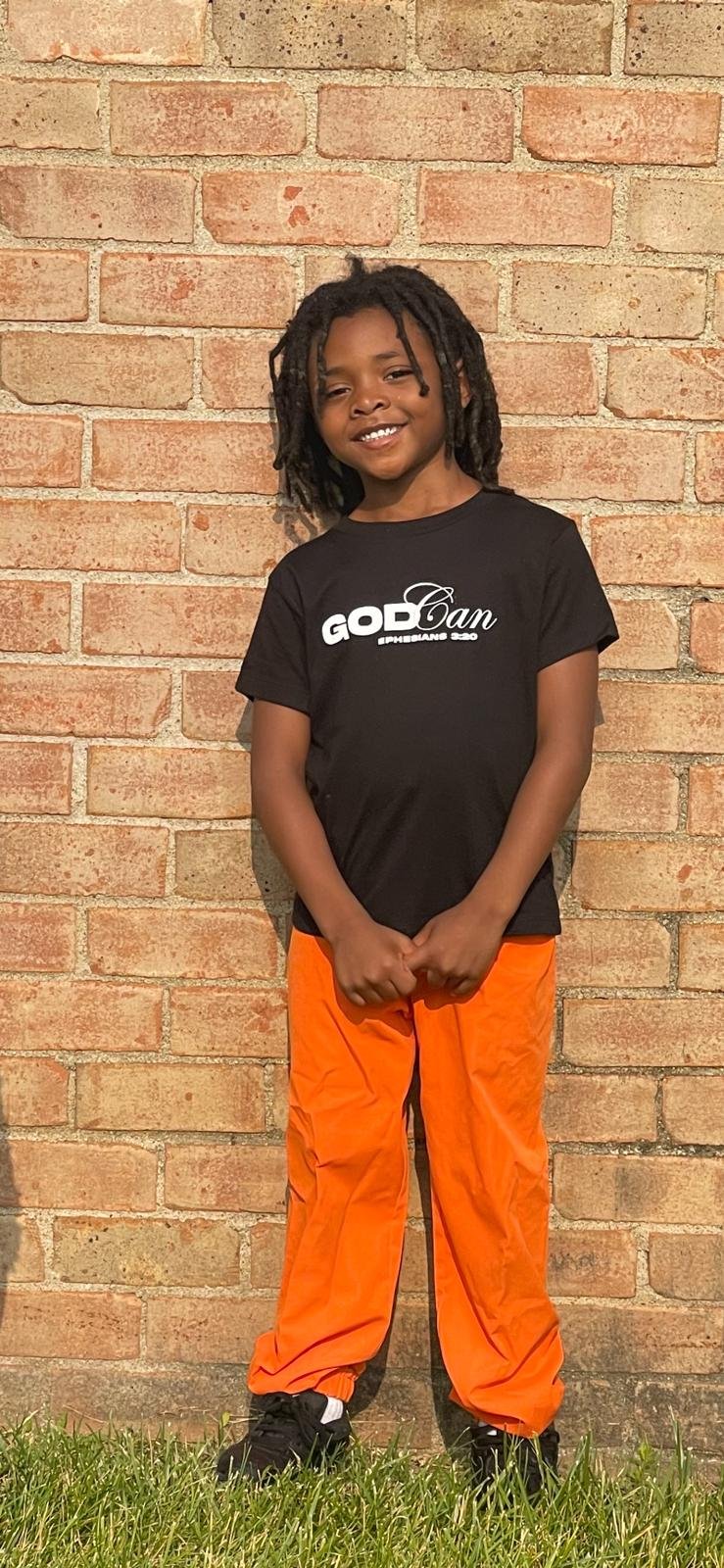
IMPROVED PRODUCT IMAGES


TAKEAWAYS
Overall, I successfully developed a clean and streamlined website that is user-friendly and responsive on mobile devices. I am especially pleased with the successful photoshoot, which significantly elevated the brand, making it more competitive with other streetwear brands. However, I believe the launch could have been even more successful with a robust social media marketing strategy to drive additional sales and traffic to the site. The brand is currently focusing on improving this aspect. As the brand grows, I plan to enhance the layout further and incorporate more of the brand's story throughout the site.